


Guide to Brightbill's Codes:Mr. Brightbill's inventory uses a number of abbreviations and codes. The rich meaning of these becomes clear to anyone who reads and commits to memory his explanation of the four series and his first appendix. For everyone else, we have created the following guide in an attempt to make this wealth of information more accessible. We suggest you keep this window open as you browse the collection -- you will probably refer to it often.
Below, you will find a few sample entries. The parts, when appropriate, are linked to a list of the codes used. For example, the element labeled "publisher abbreviation" is linked to the index of publisher codes and addresses, while "sheet number" is relatively self-explanatory, and not linked to anything.
Skip to the summary of codes.
General Layout
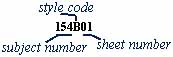
When you look at an inventory page, you will see entries similar to this.
The first part of the entry is the call number. The physical collection is organized into 4-pocketed sheets, much like baseball cards. Because the call number is the same for all cards on any given sheet, we've only listed it once.
The second part of the entry gives the details of the cards in the sheet. There will be a number of bulleted entries; each refers to an individual card. Thus, if there are three bullets, there are three cards with the same call number.
Details of the Call Number
Ā The call number has three elements.
The first of these is the subject number, also known as an index item. It refers to one of George Brightbill's 172 broad subjects.
The second element is the style code. (A) means the card is in color, (B) not in full color, and (L) that it is not on paper.
The third part of the call number is the sheet number. For example, Mr. Brightbill has filled three plastic sheets with postcards printed in full color and featuring the Betsy Ross house with one large and two small flags. The first sheet would be labeled 01, the second 02, and the third, 03.
Details of the Cards
The detailed descriptions of the cards use a number of symbols.
Unfortunately, some have dual meanings, while others appear to be synomous. Often, it is only through careful attention to context that one can tell precisely what Mr. Brightbill means. This said, we have done out best to elucidate his shorthand.
The descriptions tend to follow this general form:
- Text on front <text on back> [Mr. Brightbill's additional description, usually the image], 2 to 4 letter publisher code, publication number on back <publication number on front>, copyright information, artist information, [2 to 3 letter physical peculiarity code]
Mr. Brightbill usually gives the complete message printed on the front of the card, and sometimes a summary or transcription of the text on the back. He describes the image in some detail. Publisher codes tell which company put out the card; the publication number is the serial or printing number that company assigned the card. It is usually found on the back. It is often difficult to tell if a date actually refers to the copyright, or to some other date relevant to the card. The physical peculiarity code gives a rough idea of what the card looks like -- whether it has a decorative border, or a back divided into spaces for an address and a message.
A postcard with all this information would ideally look like this:
- Gimbel Brothers Store, <Colleen Moore's Doll House - Exhibited at Gimbel Brothers> [May 7, 1935] WPCC, GBS100090 , copyright 1935, by Ima Picturetaker <GBS100090> [USB]
However, the entries are seldom ideal.
Most of the fields are not commonly used. When they are used, they will, as often as not, be differently ordered, according to Mr. Brightbill's sense of which information is most important.
Thus, the actual entry for the first in a series of Gimbel Brothers Store's doll house display reads like this:
- Gimbel Brothers Store, WPCC [RB] [USB] Colleen Moore's Doll House - Exhibited at Gimbel Brothers [May 7, 1935]
This is despite the fact that, on the actual postcard, the description and details of the view are given on the back upper right corner. Furthermore, note that the first two fields in square brackets ( [ ] ) are both codes for physical peculiarities, while the last one could be either the publication date or Mr. Brightbill's note as to the exhibition date.
There are a few more other things to watch for, such as in this entry:
- Greetings from Philadelphia [man and woman looking at moon through telescope], PAPCC [USB]
- ... [drawing of Girard Ave Bridge inset on moon]
The elispses (...) indicate repetitive information. In this case, there are several postcards, all captioned "Greetings from Philadelphia," with a picture of a man and a woman looking at the moon through a telescope, put out by the same publisher, and with the same physical peculiarties. The only change is the image inset on the moon. Thus, the elipses encompass all of the repetetive information. Only the details which differ from card to card are given. Occasionally, [same] will be used instead of elipses.
Summary of the Codes
Index Item Numbers -- please see the Complete Index.
A -- cards are in full color
B -- cards are black and white, real photos, sepia, monotonal, or cyanotype
L -- cards are printed on linen or chromePrinter Publisher Codes -- please see Appendix I.
[ ] -- text was added by Mr. Brightbill, decribing but not printed on the cards.
< > -- text is printed on the side opposite that it is normally found on.
(...) -- indicates that any information not specified in an entry is the same as in the entry directly preceeding it.
[same] -- seems to be interchangeable with ellipses.BB -- Bottom Border
EB -- Equal Borders
EMB -- Embossed
GB -- Gold Borders
HC -- Hand colored
LB -- Left Border
RB -- Right Border
RP -- Real Photo
TB -- Top Border
TOB -- Text on Back
USB -- Un-split back
WB -- Wood Appearance Border
The Library Company of Philadephia - 1314 Locust Street, Philadelphia, Pa. 19107 - 215-546-3181
For more information regarding this collection, please contact
Sarah Weatherwax, Curator of Prints and Photographs at printroom@librarycompany.org